
Driftline Web Design Agency
PROJECT INFO
A conceptual project to design and build the complete brand identity and website for Driftline — a web design studio in the Philippines that works exclusively with resorts and spas. The challenge was circular: a studio that helps hospitality brands earn trust online had to earn that same trust for itself.
Branding, Web Design
THE CHALLENGE
Agency websites tend to show what they can do without showing they understand the client’s world. In hospitality, that gap is disqualifying. Resort and spa operators aren’t buying deliverables — they’re buying the confidence that someone already understands what their guests feel the moment they land on a page. A portfolio of clean mockups doesn’t prove that.
THE APPROACH
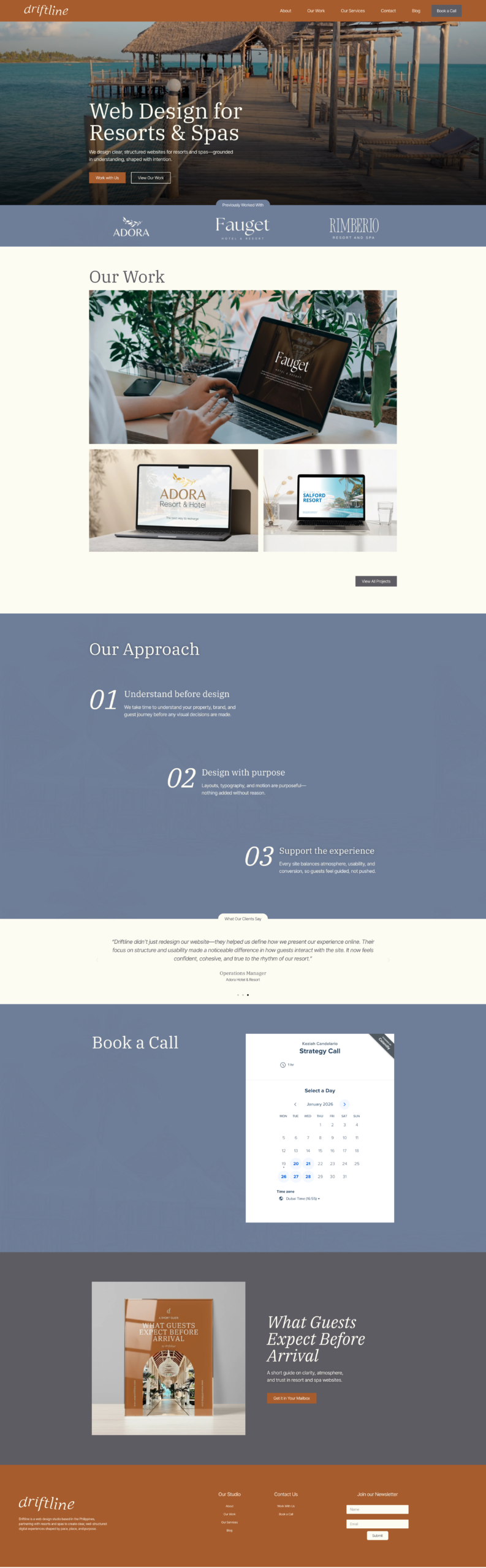
The decision that shaped everything else: four words at the top of the page. “Web Design for Resorts & Spas.” Not a mission statement — a filter. The right visitor immediately knows they’ve arrived somewhere relevant. Everyone else moves on. Both outcomes are correct.
From there: look like the work. Driftline’s clients are properties where stillness is a selling point. The studio’s own site had to carry that same quality — calm, unhurried, deliberately paced. The design references weren’t agency showreels. They were the visual grammar of the properties themselves.
DESIGN DECISIONS
THE HERO
Niche stated, choice offered
The headline names the studio’s focus before it explains anything else. Two CTAs follow — “Work with Us” for the visitor already decided, “View Our Work” for the visitor who needs convincing first. The page doesn’t push. It presents, and lets the right client self-select.
THE CLIENT STRIP
Familiarity as credibility
The logo strip sits immediately below the hero — before doubt has time to form. No captions, no “trusted by.” Familiarity with those names is assumed, because the visitor this site is built for already knows them. It’s a recognition test, not an explanation.
THE APPROACH SECTION
Method as differentiator
Three steps: Understand before design, Design with purpose, Support the experience. Step one isn’t a discovery call — it’s understanding. That word choice is doing work. The section is numbered, not listed, because sequence signals that no step gets skipped. For a resort that’s been burned by an agency that rushed, that lands.
THE TESTIMONIALS
Confirmation, not persuasion
Each testimonial echoes the studio’s own language back: care and structure, every decision had a reason, confident and cohesive. This isn’t coincidence — it confirms that the promise made at the top of the page is real. Attribution is by role, not name: General Management, Managing Director, Operations Manager. A prospective client reads those titles and sees a peer.
THE LEAD MAGNET
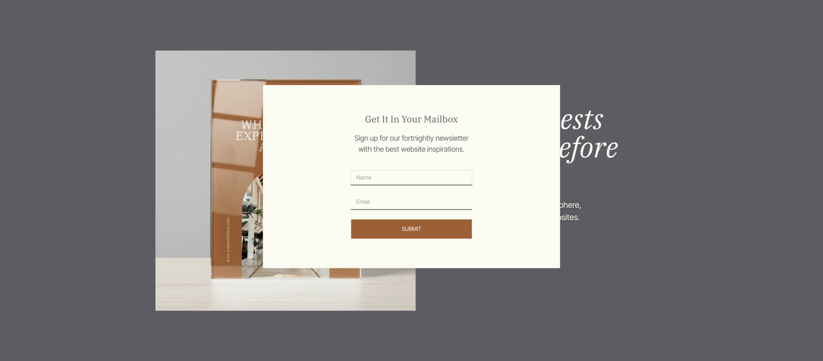
Value before the ask
“What Guests Expect Before Arrival” is framed as a resource about guests, not about web design. That makes it immediately useful to anyone running a resort — whether or not they’re ready to hire. It also signals that Driftline thinks past pixels and into the guest experience those decisions ultimately shape.
WHAT THE SITE LEAVES OUT
Silence as positioning
No pricing. No FAQ. A studio that publishes a rate card competes on price. A studio that stays quiet on price competes on fit. The absence of an FAQ is the same logic: every FAQ is a list of objections pre-published. Driftline trusts the interested visitor to reach out, and trusts the conversation to do the rest.
BRAND DECISIONS
The name “Driftline” carries water and ease without announcing it — familiar to anyone in the hospitality world, but abstract enough to belong to an agency. The identity builds on that balance.
LOGO
Wordmark, no icon
Clean and unhurried. The name carries the brand — no symbol needed. Confident without decoration.
COLOR
Deep tones + warm cream
Evokes the palette of the industry without mirroring it. Rich but structured — a studio, not a lobby.
TYPOGRAPHY
Editorial and structured
Type that reads like a design firm’s proposal, not a resort brochure. Familiar to the client, distinct from their brand.
WHAT WAS BUILT
- Logo and full visual identity system
- Full multi-page website (Home, About, Services, Work, Blog, Contact)
- Three placeholder conceptual client case studies (Fauget, Adora, Salford)
- Lead magnet with popup and newsletter integration
- Embedded calendar booking system
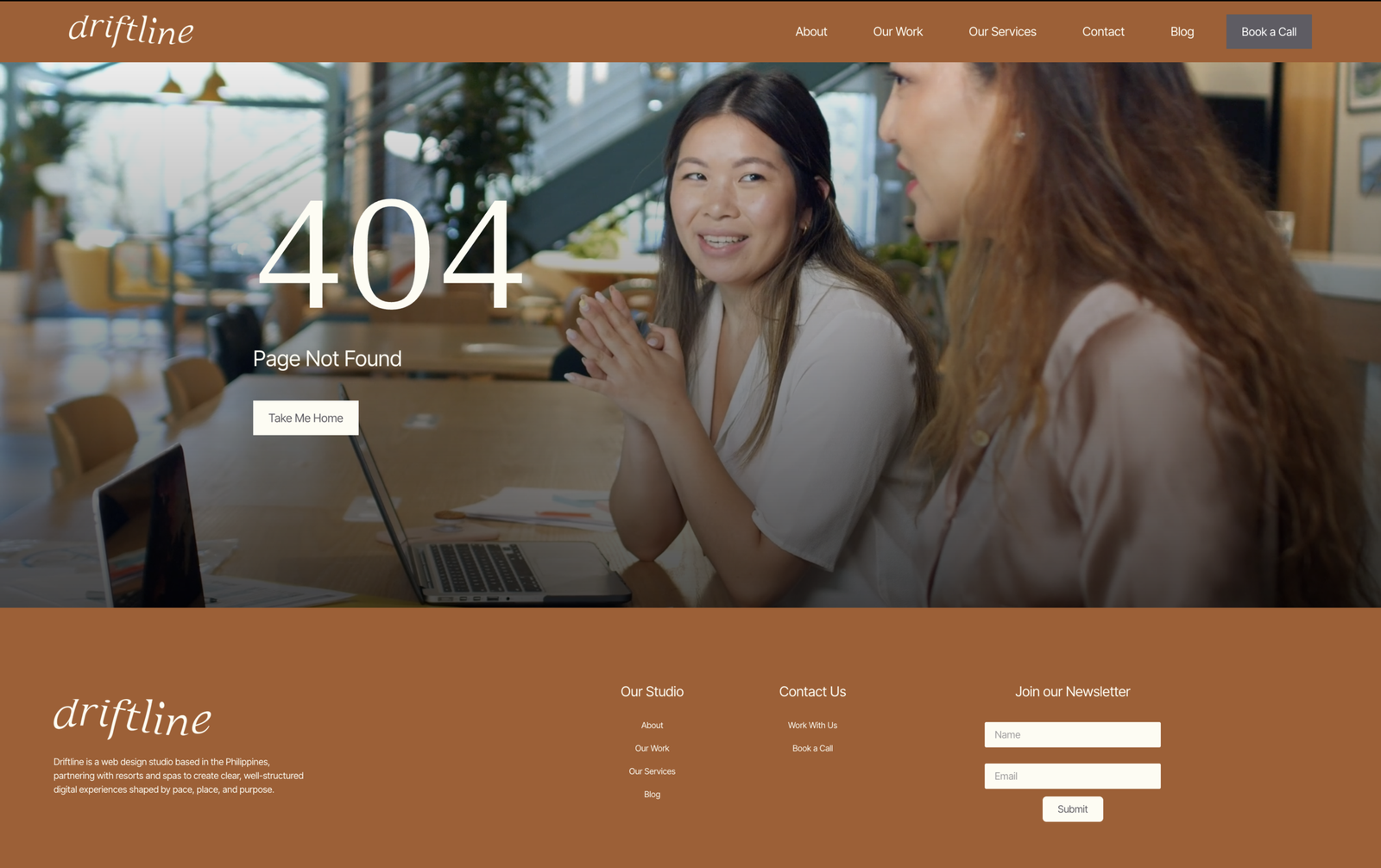
- Custom 404 page and crafted header/footer system
- Mobile-responsive layout across all pages
THE RESULT
By the time a resort operator reaches the Book a Call button, the question isn’t whether Driftline can do this. It’s whether they’re available. The site removes doubt before the visitor has finished forming it — through niche, tone, process, and proof that arrive in the right order.
It also does something quieter: it makes Driftline look like a peer of the properties it works with, not a vendor. That distinction is what generates repeat work and referrals in hospitality.
The studio advises its clients to design for the guest’s state of mind, not the brand’s ego. This site follows its own advice.