
Rafael Vega
PROJECT INFO
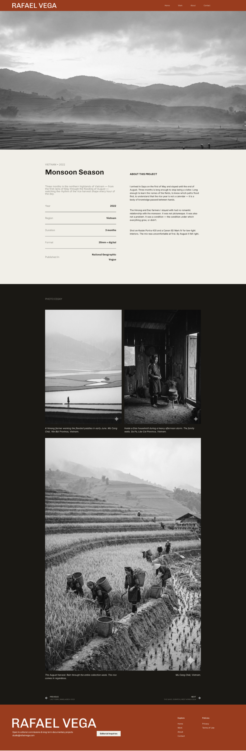
A conceptual project to design and build a complete personal website for Rafael Vega — a travel and documentary photographer with 14 years in the field and bylines in National Geographic, TIME, and Le Monde.
The brief was not simply to present his work. It was to build a site that attracts the kind of editorial commissions he actually wants — and makes it easy for the right client to say yes.
Branding, Web Design & Development
THE CHALLENGE
Photographers at Rafael’s level rarely have a conversion problem in the traditional sense. They don’t need more traffic. They need better traffic — editors and art directors who are already looking for someone like him, and just need enough to make the call.
Most photography websites fail this in one of two ways. A sterile image grid gives the work nowhere to land — no context, no voice, no reason to reach out rather than move on. An over-designed showcase buries credibility under atmosphere, signaling style over substance to exactly the kind of client who values the opposite.
Rafael’s site needed to do something harder: communicate a specific, uncompromising point of view — and make contacting him feel like the obvious next step.
THE APPROACH
The design reference wasn’t other photographer websites. It was editorial magazines — National Geographic, Le Monde — publications where the design has a point of view without competing with what it frames. Familiar to the client. Authoritative by association.
The strategic logic was simple: every design decision should either build credibility, qualify the visitor, or reduce friction at the moment of inquiry. Nothing decorative. Nothing that makes the site harder to act on.
That meant structure over atmosphere. Generous white space as a commitment, not a style choice — every image earns its room. A visual identity built entirely from scratch to match the persona: spare, direct, and quietly confident.
DESIGN DECISIONS
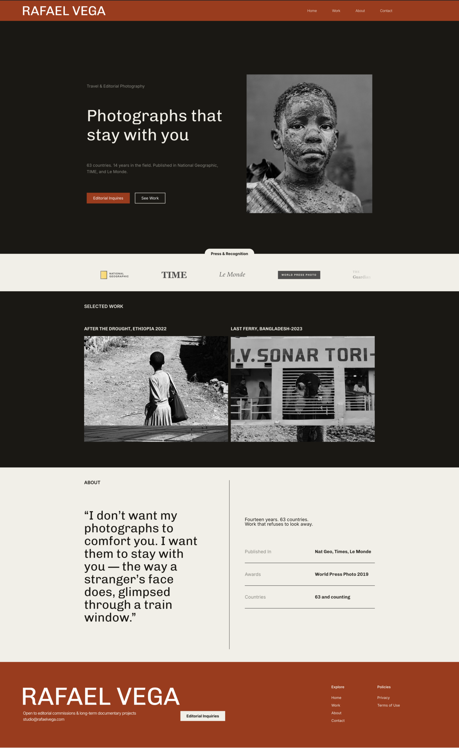
THE HERO
Two CTAs, two types of visitor.
The hero presents two calls to action immediately: “Editorial Inquiries” for the visitor who is ready to talk, and “See Work” for the visitor who needs to be convinced first. Neither competes with the other. The right client self-selects at the first scroll.
THE CLIENT STRIP
Trust before doubt.
The publication carousel — National Geographic, TIME, Le Monde, World Press Photo, The Guardian — appears before the visitor has scrolled far enough to question the rates. This is deliberate placement. Credibility has to land early or it lands too late.
THE ABOUT SECTION
The pull quote as a filter.
The about section leads with Rafael’s artist statement, not his biography. This is a qualifying decision. Someone who doesn’t connect with that statement will leave — and that’s the right outcome. Someone who does is already persuaded before they read a single credential. The stats that follow — 63 countries, 14 years, World Press Photo 2019 — close the argument the quote opens.
THE FOOTER
No dead ends.
The footer repeats the email address and an Editorial Inquiries CTA. A visitor who reaches the bottom of the page and wants to act should never have to scroll back up to find out how.
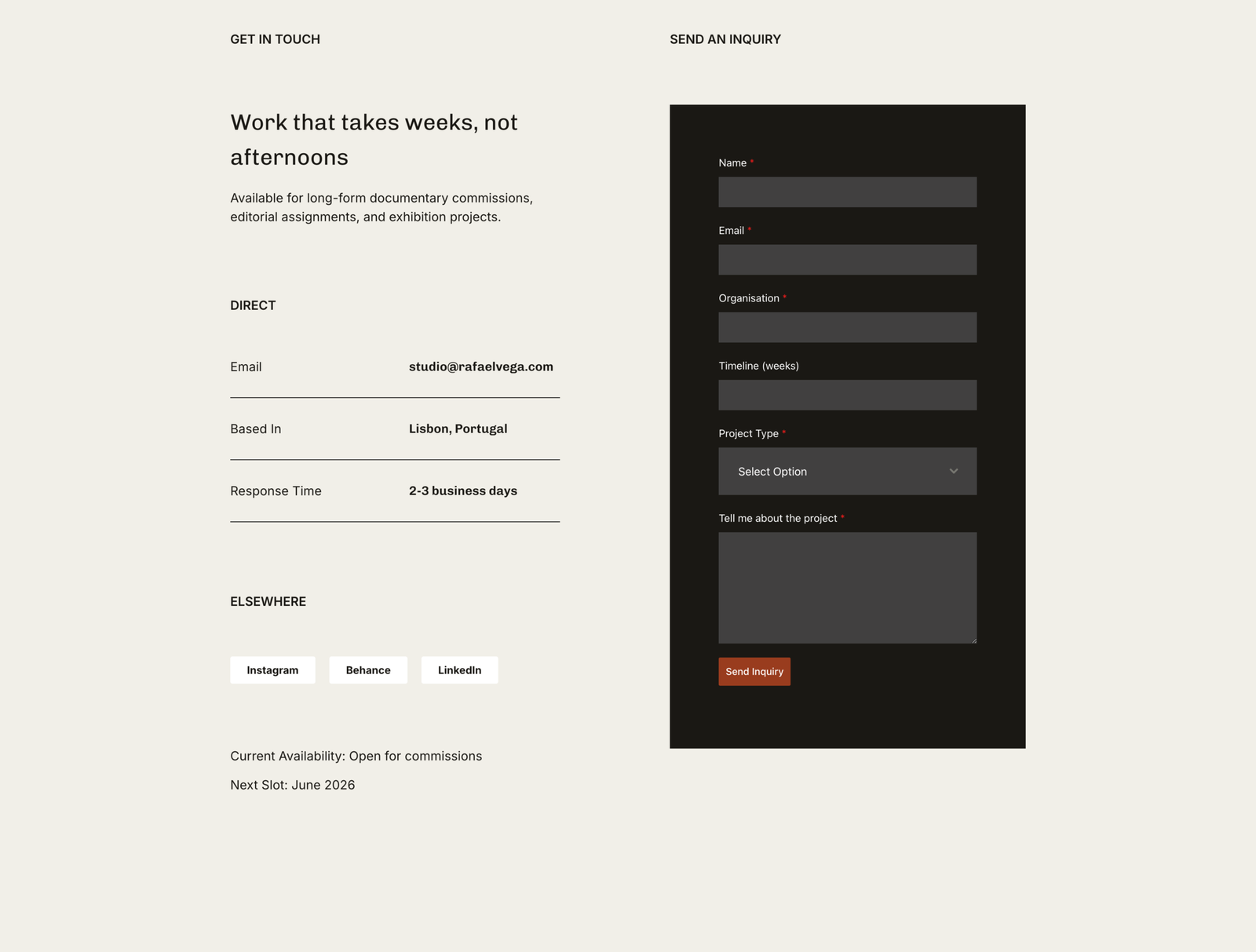
THE CONTACT FORM
Low friction at the moment it matters most.
Built with Forminator and custom-styled to match the palette, the form asks only what is necessary. A form that looks like it belongs to a different website — or asks too many questions — breaks the experience at exactly the wrong moment. This one doesn’t.
WHAT THE SITE WITHHOLDS
Restraint as a positioning tool.
No pricing. No FAQ. No step-by-step explanation of how to commission a project. This is consistent with the brand voice — quietly confident, work-first — and it communicates something important to the target client: Rafael is not chasing work. He is available to the right project. That distinction matters to the editors and art directors this site is built for.
BRAND DECISIONS
LOGO
Wordmark
No icon. The name is the identity. The kind of mark that looks at home on a magazine masthead or an exhibition wall — which is exactly where Rafael’s target clients spend their working lives. Confident without performing confidence.
COLOR
Obsidian, Parchment, and a single ember
Obsidian (#1A1814) anchors the typography. Parchment (#F1EFE8) gives the page warmth without softness. Dusk (#888780) handles captions and secondary elements — present but subordinate to the images.
The accent — Ember (#993C1D) — appears exactly once per page, never decoratively. It is the color of hard truths. Rafael’s work is about unveiling what people prefer not to see, and that particular red-brown carries that intention without announcing it.
TYPOGRAPHY
Geometric and editorial
Headlines set in a structured geometric sans with quiet weight — enough presence to command, enough restraint not to compete with the photographs. Body and UI copy in a neutral, screen-optimized sans that prioritizes legibility above all else. Two voices: one announces, one serves
IMAGERY
Sourced and AI-generated, art-directed throughout
Images were drawn from two sources: photographs sourced online and editorial images created with AI generation tools. Both were selected and treated with the same eye — no stock-photo softness, no artificial heroism. The AI-generated images were prompted with the same specificity Rafael would bring to an actual shoot: specific light, specific subjects, specific tension.
WHAT WAS BUILT
- Logo and full visual identity system built from scratch
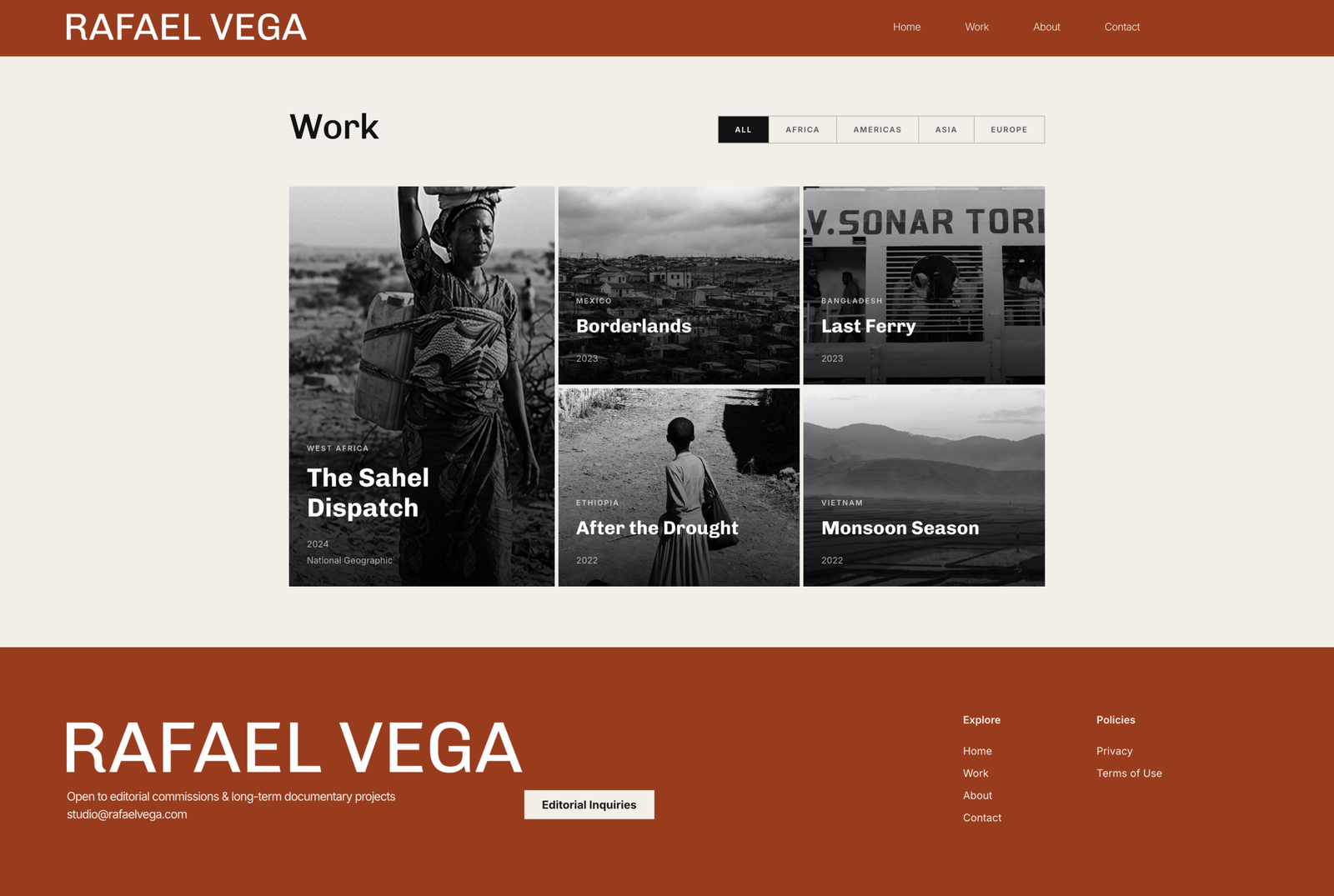
- Multi-page WordPress website (Home, Work, About, Contact)
- Work page and logo carousel built in pure HTML with AI assistance
- Custom coded lightbox with AI assistance
- Individual project spread pages for five documentary series
- Custom contact form built with Forminator
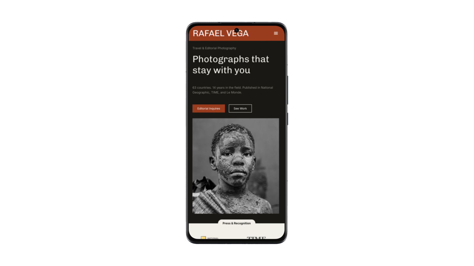
- Mobile-responsive layout across all pages
THE RESULT
The site filters as much as it attracts. That is not a limitation — for a photographer at Rafael’s level, it is the point. The design doesn’t try to appeal to everyone. It tries to be immediately, unmistakably right for the people who are already looking for someone like him.
Every section earns its place. Every decision has a reason. The result is a website that doesn’t just show the work — it makes the case for it, and makes it easy to act on.
Work that refuses to look away deserves a website that doesn’t either.